Jump to ratings and reviews
Rate this book

Atlas of Science: Visualizing What We Know

Rate this book

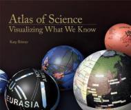
Cartographic maps have guided our explorations for centuries, allowing us to navigate the world. Science maps have the potential to guide our search for knowledge in the same way, helping us navigate, understand, and communicate the dynamic and changing structure of science and technology. Allowing us to visualize scientific results, science maps help us make sense of the avalanche of data generated by scientific research today. Atlas of Science, features more than thirty full-page science maps, fifty data charts, a timeline of science-mapping milestones, and 500 color images; it serves as a sumptuous visual index to the evolution of modern science and as an introduction to "the science of science"—charting the trajectory from scientific concept to published results.

Atlas of Science, based on the popular exhibit "Places & Spaces: Mapping Science," describes and displays successful mapping techniques. The heart of the book is a visual feast: Claudius Ptolemy's Cosmographia World Map from 1482; a guide to a PhD thesis that resembles a subway map; "the structure of science" as revealed in a map of citation relationships in papers published in 2002; a periodic table; a history flow visualization of the Wikipedia article on abortion; a globe showing the worldwide distribution of patents; a forecast of earthquake risk; hands-on science maps for kids; and many more. Each entry includes the story behind the map and biographies of its makers.

Not even the most brilliant minds can keep up with today's deluge of scientific results. Science maps show us the landscape of what we know.

Exhibition

Ongoing

National Science Foundation, Washington, D.C.

The Institute for Research Information and Quality Assurance, Bonn, Germany

Storm Hall, San Diego State College

272 pages, Hardcover

First published October 31, 2010

4 people are currently reading
143 people want to read

About the author

Katy Börner

11 books7 followers
Katy Börner (born 1967 in Leipzig, Germany) is an engineer, scholar, author, educator, and speaker specializing in data analysis and visualization, particularly in the areas of science and technology (S&T) studies and biomedical applications. Based out of Indiana University, Bloomington, Börner is the Victor Yngve Distinguished Professor of Engineering & Information Science in the Department of Intelligent Systems Engineering and the Department of Information and Library Science at the Luddy School of Informatics, Computing, and Engineering and a member of the Core Cognitive Science Faculty. Since 2012, she has also held the position of visiting professor at the Royal Netherlands Academy of Arts and Sciences (KNAW) in Amsterdam, the Netherlands,[1] and in 2017-2019, she was a Humboldt Fellow at Dresden University of Technology, Germany.

Börner is the founding director of the Cyberinfrastructure for Network Science Center, an organization dedicated to the study, development, and promotion of tools and services for the analysis and visualization of large-scale networks, particularly in the areas of biomedical, social, and behavioral science, physics, and technology.[2] She is also the curator of the international Places & Spaces: Mapping Science exhibit, a collection of science maps and macroscope tools that seeks to educate the general public about science mapping and empower individuals to create their own data visualizations.[3]

In 2015, she was appointed to a two-year term as member of the U.S. Department of Commerce's Data Advisory Council.[4] Since October 2018, she has served as a Trustee of the Institute for Pure & Applied Mathematics (IPAM), NSF Math Institute at UCLA.[5]

Ratings & Reviews

What do you think?
Rate this book

Friends & Following

Create a free account to discover what your friends think of this book!

Community Reviews

5 stars
19 (46%)
4 stars
17 (41%)
3 stars
3 (7%)
2 stars
2 (4%)
1 star
0 (0%)
Displaying 1 - 5 of 5 reviews
94 reviews1 follower
February 10, 2025
Nice and interesting, however quite short. More a summary and a general request to the scientific community to do more stuff like this.
Profile Image for Michael Scott.
771 reviews159 followers
February 9, 2014
I got this book as a gift for giving a keynote, back in 2012, and have been wanting to read it ever since. Finally! Atlas of Science Visualising What We Know is a science-artsy book about the representation of the way scientists are inter-linked (through co-publishing, citing, co-citing, citing across strands and domains of science, etc.) The authors act as cartographers of science, that is, they draw and depict rather than do statistics and show numerics.

Overall, this was an excellent book -- it was inspiring and changed my way of looking at science. (And I'm a scientist by trade.) I loved the innovative designs, the intro to the science of cartography of science, the discussion about bibliometrics and science performance-indices, the artsy presentation. I got a visual expression of how my own trade relates to others. Thumbs up, up, up! (Next to Edward Tufte.)

One of the things that I expected to find but still was overwhelmed by the quality and quantity, is a thorough list of references to techniques, tools, and major publications and books. The book covers a few hundreds, but the selection is excellent and I was quickly into learning mode. (Again, I'm a science professional, yet rarely have I heard my peers going to this technical level.)

I enjoyed the listing of computer games related to representing science and its evolution, among which the authors mention SimCity, Spore, Civilization (Sid Meier, wink! wink!). Good stuff.

I was surprised to hear about the museum exhibitions, one of which even happened to occur in Amsterdam (missed it).

I liked the idea of a future, cloud-based (disclaimer: cloud computing overlaps with my domain of expertise, distributed computing systems) Daily Science Forecasts. This idea is well built, well argued for, perhaps lacking some of the critical detail but overall very good.

Perhaps the only thing I disliked is the heavy self-citation: the main author Katy Borner and her team take about 30% of the entire set of lengthy presentations. Good stuff, but not sure how fair.
Profile Image for Katherine Collins.
Author 17 books13 followers
June 2, 2014
Take Tufte’s data visualization, apply it to some of our most interesting scientific questions, and you have Borner’s Atlas of Science. Think of the web that maps connections between various scientific disciplines, then imagine how this morphs over the course of the decades, with some pieces more and more tightly linked and others unraveling before our eyes. Ponder alongside “Information Graphics”.
Profile Image for Charles.
158 reviews6 followers
July 23, 2011
Beautiful coffee table style book with a variety of information graphics and explanations. You can see the maps at http://scimaps.org The book is large and physically heavy so definitely NOT a book for reading on the train!
Displaying 1 - 5 of 5 reviews

Can't find what you're looking for?

Get help and learn more about the design.