
Development - Book Design
As someone who’s been involved in a variety of design fields, from video game design to fashion and costume design, the look of the Wardenclyffe Series was something very close to my heart. As important as the story in each book is, I didn’t want to forget about the layout and design of the physical books themselves. After all, I think the look of a book can tell you a lot about what the story is going to be like.
When I first began the design for Book 1 in the series, I wanted to take some inspiration from some of the books that I had loved growing up. I looked at everything from the sizes of books, interior layouts, cover designs, and everything that goes into making a book. And even though I was only working on the first book, I wanted to set up a style that I could use for the entire series as I worked on the other books.
I knew I would be publishing both a hardcover and softcover edition of every book so I decided to start by figuring out the best size for each one. For the paperback, I looked at some of my favorite paperbacks, specifically the 1994 edition of The Chronicles of Narnia. Each book is a small, easy-to-carry size, perfect for a paperback novella. So once I got my final cover design, I printed it out on printer paper and wrapped it around my copy of The Magician’s Nephew to get a sense of how it would look at that size. The more I held it, the better it started to feel so I ultimately decided on the 4.25” x 7” size for the paperback.

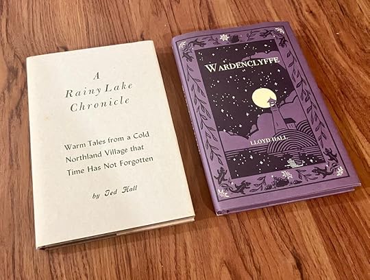
Now, for the hardcover, I took inspiration from a slightly different place. As I talked about in my Self-Publishing blog post, my grandfather was also an author who self-published his own books. His were beautiful hardcover books with matching dust jackets that he would print at his small printing press up in northern Minnesota. So for my hardcover, I decided to print it at the same size as all three of my grandfather’s books, complete with similar-style dust jackets.
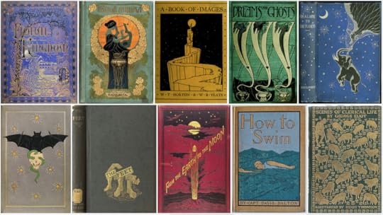
The next major piece of the books I wanted to look at was the exterior design, including things like the covers and spine design. I’ve always loved the look of old, leather-bound books with the embossed covers but unfortunately, that was not in my budget for self-publishing my own books. That being said, I did still want to take inspiration from those types of covers, even if it wasn’t going to be in leather. Abby Spence, who painted the beautiful cover, was able to include so many details that paid homage to the classic book covers like intricate border designs and highlights of gold/yellow that remind one of gold embossing.
And while each book is a part of the series, the stories themselves are standalone, all about different characters and their own adventures. And I wanted the design of the covers to reflect that. They all have similar border details and a unique central image that helps tie the look of them together, but each book also has its own, unique color palette to help make it stand alone. It’s a tough balance between making each book look cohesive with the others, yet still unique and individual but one I feel was accomplished.

The other thing I wanted to focus on was the interiors. Despite it being science fiction, I was going for a more classical look with the books in the Wardenclyffe Series. I’ve always admired books from the late 1800s and early 1900s that had beautiful black and white etchings in them, ones like Alice in Wonderland and, of course, the Chronicles of Narnia. Once again I found an incredible artist, Minna O., who helped me create a series of beautiful black and white illustrations, once for each chapter.

I cannot express how happy it made me to finally hold the finished books in my hands. Everything came together exactly as I had pictured it for the first book and I knew I’d found a style I’d be happy with going forward for the others in the series. Hopefully it won’t be too long until I can see all the books in the series laid out together as a matching set!


