
SciFi and Fantasy Book Club discussion
Members' Chat
>
But what kind of cover is it?
 my big one is -- Do NOT put obvious photos on high fantasy. Ever!
 Enough photoshopping to make it look like art, not photography is needed.
 Easier to say what I don't like:
Overcrowded images,
Covers lacking focus or composition.
 Looking at this month's reading I very much like


I prefer
 for The Shadow of the Torturer.
I went to great lengths to get
 instead of
 . It's the same book but I prefer the first cover.
I find
 too plain.
I don't know what that all means but those were my thoughts this month.
 Sarah wrote: "I prefer for The Shadow of the Torturer."
Now that is interesting, because I really don't like this cover at all. For me it is far too flat. This one,
 , has a sense of depth and mystery the other lacks, particularly the way the landscape falls back into suggestion and hidden immensity. Clearly this has something to do with my psychological make up! (And I now know how to put cover images on my messages. Thank you.)
I like the other covers, and agree with you on your Dan Simmons choice, Danse Macabre vs Golem. I quite like the Madness of Angels cover as well, but not the figure to the foreground. There is something glib about it.
Pete wrote: "Overcrowded images, Covers lacking focus or composition."
Agreed, but what about style? Pen, Paint or 'Puter?
I think what I like about "my" Shadow of the Torturer is that it has a plain background with a prominent image of a person and then a very delicate hint of color. When I look at what I like, it seems to be simple backgrounds, a solitary figure, and a splash of color. Simplicity maybe? To me, the Shadow cover you chose is too busy somehow, although I don't know how. It's interesting that A Madness of Angels fits what I like but I don't care for it. There's not enough definition in the human/angel image.
 I don't like generic covers. Something that's just typeface on a gradient, or a sword hilt, or random spaceships which have nothing to do with the story. I like it when they illustrate a scene or character from the book.
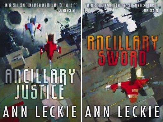
I have no idea who did the covers for the Harry Dresden books, for example, because the dude on the cover looks nothing like the character. The covers for Ann Leckie's books are just like random pictures of spaceships.
What do these have to do with the story? Literally nothing. These are random video game spaceships that don't even resemble the ships in the book.
Michael Whelan's covers are almost uniformly awesome, with the one he did for The White Dragon being one of the all-time great covers.
The covers for Marie Brennan's Lady Trent books are brilliant. They do double duty of telling you these are Fantasy novels, but they're also Audubon-like naturalist drawings of dragons, which is exactly what Lady Trent is .
 Based on the covers, I was thinking Ancillary Justice was going to have a bunch of space battles.
Sarah wrote: "Based on the covers, I was thinking Ancillary Justice was going to have a bunch of space battles."
Based on the covers, I was thinking Ancillary Justice was going to have a bunch of space battles.
Sarah wrote: "Based on the covers, I was thinking Ancillary Justice was going to have a bunch of space battles."I agree. They're absolutely terrible. I don't know why anyone likes them.
They remind me of the horrible John Berkey spaceship covers from the 1970s. Maybe the ship is cool -- although usually it isn't -- but they don't resemble the description at all.
And then there's the 80s covers. I almost died when I was reading
 . I would not have been reading that baby in public!
It's hard not to judge a book by its cover when they're actively embarrassing. Which is pretty much every Baen cover ever.
Trike wrote: "It's hard not to judge a book by its cover when they're actively embarrassing. Which is pretty much every Baen cover ever."
. I would not have been reading that baby in public!
It's hard not to judge a book by its cover when they're actively embarrassing. Which is pretty much every Baen cover ever.
Trike wrote: "It's hard not to judge a book by its cover when they're actively embarrassing. Which is pretty much every Baen cover ever."I had to look that one up. I found a list of The 6 Worst. I don't know if the totally sexist
 is worse or

 My favorite book cover of all time at this point would have to be
 . I was already invested in the author but the cover was so pretty!! it's what made me buy the book instead of waiting for a library version.
 my least favorite covers are the ones with angst-ridden close-ups of faces on them. case in point,
 I really like this series but the cover is really embarrassing to read. it makes me feel like a teen stereotype, and that's just no fun at all.
Grace wrote: "My favorite book cover of all time at this point would have to be . I was already invested in the author but the cover was so pretty!! it's what made me buy the..."
I really like this series but the cover is really embarrassing to read. it makes me feel like a teen stereotype, and that's just no fun at all.
Grace wrote: "My favorite book cover of all time at this point would have to be . I was already invested in the author but the cover was so pretty!! it's what made me buy the..."I like that one as well.
I've seen a lot of guys wanting YA books to be published with more male-friendly covers because of the embarrassing factor.
And would any of us ever read this gem in public:

I seriously need to dig through my covers for more lovely examples instead of ridiculous ones.
Grace wrote: "My favorite book cover of all time at this point would have to be . I was already invested in the author but the cover was so pretty!! it's what made me buy the..."Different strokes for different folks. Those are exactly the kind of generic "could be anything" covers I dislike.
Hmm... I'm guessing it's about wolfie shapeshifters. Now I'll go check.
Yeah Trike, covers are definitely a matter of taste--pretty much any cover that looks like a contemporary or romance novel scares me away at once, but covers with a bit of mystery as to the contents (and a suggestion of fantasy) intrigue me :) @Sarah oh dear! I'll take angsty faces over that horror any day XD
Nope. Demon riders. Well, I would have gotten the YA part right and I really love the colors.
@Sarah I know, they're so pretty! and the demon riders are just cat shapeshifters, so you were pretty much spot-on :)
 Easier to show some that I like:


 .
.I do like the Ancillary Justice covers, probably more so after reading the first 2 books. :-)
 This is a related issue about covers: their texture. I 've noticed trade paperbacks with covers that are different from the traditional laminated plastic. One is a cover with a waxy texture. Another is a cover with a grainy or scratchy texture. Both are very unpleasant to touch.
 I still buy paper books because I find them more relaxing to the eyes and I like the tactile experience of holding a book. But these waxy and scratchy covers put me off. In fact, I refused to buy a couple books at the store today because I knew I wouldn't like holding them as I read. I'm going to try to find them in hardcover at the public library.
Has anybody else had this experience? Your opinion?
M.L. wrote: "Easier to show some that I like:...."I look at these and I see geometric and bold colors.
M.L. wrote: "Easier to show some that I like:...."See, this I don't get at all. Ready Player One looks like they had zero ideas and picked a font at random. Of all the ideas they could have used for that cover based on the title alone, they just did... nothing.
The Armada one actually looks like what it's supposed to be about.
When I was reading Seveneves I kept thinking the title was Seveneyes because of the cover. It actually looks to me like the guy also misread the title and just used an eye. There are many repeating leitmotifs in the book, yet none of them have anything to do with eyes or seeing.
 Well, since I read most of my books translated it's kinda indifferent for me which cover the book has, since I most likely borrow it from library and won't buy it at all. But if I buy books (almost always in English) I buy the edition which cover I like the most, if there are options avaiable.
For example, in up-coming books I'm planning to buy, I prefer the British version of Sharps Ends
 more than the American one
 , which is just plain boring and also a bit ugly in my opinion.
Also in some books I prefer the so called older version of the covers, like in this Un Lun Dun one:
 vs. the new, uglier one
 . In other of his books, the black covers are OK, but in this one the colorful one is just more eye-pleasing to me.
Here are also some examples of very pretty book covers (in my opinion) of books that are translated into my language (Finnish) that I'd like to get. First one the whole of the New Sun -series by Gene Wolfe in order:
 ,
,
 ,
,
 and
and
 . Pictures don't really give them justice, in nature the colors are more lively and accents are more golden etc.
 Also the SOIAF series printed in hardcover are very nice, even if I don't like the series and won't read them myself:
 ,
,
 and
and
 (three first books). They are also avaiable softcover, which came out first, but they don't look as nice, even if they use the same pictures as the hardcover ones, like this one of the first book:
 .
.
 Dragons. Dragons dragons dragons dragons.
Dragons.
If it's a series, I think a consistent approach is needed. A minimalist, family crest type approach can work, but if you jump from that to a totally different cover style that can jar.
My own preference is a for a drawn/painting style. Whilst covers aren't something that would put me off, I'm not fond of photos.
Bit obvious, but the title/author name and image should be clear. Sometimes darker covers can overdo it and make it hard to see what's going on. Likewise, a cluttered cover can distract rather than draw the eye to what's important.
Thanks to everyone who contributed so far to this thread, it has given me a lot of food for thought. One thing I am picking up is that photo's seem to be generally frowned upon (especially for fantasy). I had a conversation that covered this very topic some time ago and I was told at the time that fine art was giving way to photo manipulation as people preferred it. I am beginning to question that assertion.The bad covers don't surprise me at all. Does anybody like these?
Though the variety of different styles we already have, for such a small sample, is pretty diverse, I am particularly intrigued by the Finnish covers for the works of George R.R. Martin and Gene Wolfe. A very different take on the books indeed. Also, the 'Seveneves' phenomenon is something I have noticed before and I am wondering whether there is an occasional disconnect between author and artist, because it really does look as though the title of the book has been misread. I can't think of another example at the moment, but this does ring a bell. (Read a book and wondered afterwards why the cover art did not reflect anything inside the book at all!)
Simon wrote: " I am wondering whether there is an occasional disconnect between author and artist."Fortunate -- and powerful -- indeed is the author who gets any say at all in the cover. The Art Department sticks something on it and maybe the editor gets some say and maybe not.
Unless you're in indie. (Small press may be a bit more flexible)
Mary wrote: "Fortunate -- and powerful -- indeed is the author who gets any say at all in the cover. The Art Department sticks something on it and maybe the editor gets some say and maybe not."It is the complete disconnect that amazes me. That the cover doesn't reflect the content? What are the art department thinking of? In the companies I have had experience of, if the graphic design did not reflect the product then all hell would break loose. Heads would roll, families would be sold into slavery and entire communities would be put to the sword!
Unless you're in indie. (Small press may be a bit more flexible)"
Agreed, but there are downsides to Indie also.
Book covers fascinate me. It's the sheer variety. And most of them work in one fashion or another, if not for one person then for somebody else.
 Thaddeus wrote: "Dragons. Dragons dragons dragons dragons.
Dragons.
If it's a series, I think a consistent approach is needed. A minimalist, family crest type approach can work, but if you jump from that to a tot..."
Something like this:

^_^
Simon wrote: " That the cover doesn't reflect the content? What are the art department thinking of? "That it gets the genre vaguely right? Also, many authors have really stupid ideas about what makes a good cover.
Agreed, but there are downsides to Indie also.
How true. Making covers is hard. A lot of indies buy theirs (but still call the shots then).
Mary wrote: "That it gets the genre vaguely right?"Probably the only thing going for them. I would still have them put to the sword, though, or possibly 'worsted by the men of Carn Dum!'
I have a lot of books by artists on my book shelves who were either bookcover artists or produced graphic novels. I have only one artist that was famous for album covers (Roger Dean - 'Yes' and 'Osibisa') , and one famous for concert posters (Rick Griffin - 'Jimi Hendrix Experience'). I also have artbooks that cover production design for a number of films, but most of the artbooks I have are by artists I discovered through books. With the concept of the 'album' dying a slow death (or so we are told), and the rise of the music video (and the rise of the cinematic game trailer), I find myself wondering whether books might not go the same way. Will book cover art survive? Will book covers be replaced by trailers?
AJ, that's a nice take. One of the Death Gate Cycle covers (fourth, I think) has a dragon's head and neck rearing up from lava, and that looks pretty good.
Trike wrote: See, this I don't get at all. Ready Player One looks like they had zero ideas and picked a font at random. Of all the ideas they could have used for that cover based on the title alone, they just did... nothing."M.L. wrote: "Easier to show some that I like:
[bookcover:The Butlerian Ji..."Lol, that's funny. I have the physical books and love the covers. They are not for everyone, that's for sure!
Ready Player One, I love the fact that you only get the computer game signal... "Ready Player One" and the colors, fun colors, the cover can't contain them.
Seveneves, this is a great cover, matte black and the blue is metallic, title and name embossed. The pupil (physical cover), reflects the view of an earth landscape as viewed from ISS. The slight shadow (to me) signifies a ghost of where the moon once was. The eye is one of the Eves looking from ISS back at, no more earth. (His descriptions of ISS are spot on.)
Armada is also black matte, looks like graphite, and metallic green/blue. The way the "A"s lean in makes a mirror image, the effect appearing modern and retro at the same time, much as the story is supposed to be.
The Butlerian Jihad (Dune), is huge and gorgeous. The title looks retro, blaring--outsized just like the monster book it is--and the picture is layered and kind of abstract.
These are much different in hardback which I have or did have, for me, bigger impact. Except for Ender, paperback.
Maybe you have to like modern art, which I love, as well as classic and just about every other kind, but these in particular. Arts, like books, though are subjective! I like the Audubon dragon too! :-)
 I don't really know, for me, what draws my eye to certain covers. Probably color and contrast is one of the first things.
 One book I saw recently in a store which cover caught my eye was:

I haven't read it, yet, so it might be crap.
Also just things on the cover which makes it seem like it could be a kind of story I like. I like faerie stories, for example, so my eye would pick out a cover with a faerie on it. A dirigible or something steampunky might catch my eye. Regencu gowns or Wild West attire with glimmerings of magic. Basically just something which speaks to the type of book it is.
On thing I will say, though, is I hate the really amateurish self-drawn type covers some indie authors put forward. I know that it's got to be hard or expensive to get a good cover for your book, but if something looks cheap or some amateurish photoshop hackjob, I'm turned right off.
 I definitely prefer artistic covers, no photos ever, where a lot of thought and effort goes into the art. I don't necessarily need it to be descriptive as long as it's atmospheric.


Regarding Ancillary Justice, I love the cover art. Is it a scene from the book? No. But the art is well done and it's evocative. It lets you know it's a space opera. Plus, I love John Harris' artwork.
The Dresden Files covers are done by Chris McGrath, and yeah, his stuff is really generic. And he's become synonymous with urban fantasy. By my count, there are three instances when Tor has changed the cover art of a series mid-series from the original art to one by McGrath because of the perception that urban fantasy is more popular and thus people will be more likely to it pick up.
Benjamin wrote: ""Lovely cover! I have just had a brief look at Richard Anderson's art. Thank you for introducing this. Yet another artist to watch. (And he even does the occasional nod to Frank Frazetta!)
Benjamin wrote: "Regarding Ancillary Justice, I love the cover art. Is it a scene from the book? No. But the art is well done and it's evocative. It lets you know it's a space opera. Plus, I love John Harris' artwork."That's one of the things that's so wrong about the cover: the story is NOT a Space Opera. My review.
 I didn't reply to this yet? And Shadow of the Torturer is mentioned in the very first post? Wow! I'm going to echo that. I love it. I am very similar to Simon's taste. Keep it minimal, but show a painting of a scene or something from the book.


 Kenneth wrote: "I didn't reply to this yet? And Shadow of the Torturer is mentioned in the very first post? Wow! I'm going to echo that. I love it. I am very similar to Simon's taste. Keep it minimal, but show a p..."
Then can I recommend a book by Bruce Pennington?
 has much of his artwork for books, and the double page spreads of the Gene Wolfe series are beautiful. I also really like some of the covers you have there, especially
. I might investigate further...
has much of his artwork for books, and the double page spreads of the Gene Wolfe series are beautiful. I also really like some of the covers you have there, especially
. I might investigate further...
 Sarah wrote: "And would any of us ever read this gem in public:"
Well, I openly read:
 ,
,
 ,
,
 ,
,
 ,
,
 back in the day and other similar cover themed books, so I would not have a huge problem reading that Stross book openly.
 I actually had a greater 'problem' openly reading
 .
. I would have had a problem reading this one:
 . And this is one of Heinlein's kids books.
I think I had nightmares about this one:

 I happen to like BAEN covers, and I like the cover of Renegade's Honour. I also like the Warhammer 40k covers
 a lot.
Show me what the contents look like, especially ships, weapons and armour. Obscure fragments of sword handles and indistinguishable bits of landscape don't do anything for me at all.
 For the most part, I don't really care about covers when I'm reading at home, but it would be nice to have something I could read in public without embarrassment. That means no scantily clad women, shirtless heroes or frickin' dragons. To be honest, I'd prefer something abstract and artsy.
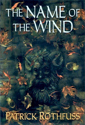
 This version of the "The Name of the Wind" cover is just about perfect. It looks nice, it actually relates to a scene from the story, there's nothing about it that screams fantasy, and frankly, I think it's far more interesting than some image of an imposing/attractive figure.
To clarify, I won't let a book's cover stop me from reading it in public, but I would prefer something I won't have to be embarrassed about.
Stan wrote: "For the most part, I don't really care about covers when I'm reading at home, but it would be nice to have something I could read in public without embarrassment. That means no scantily clad women,..."So no nekkid couples doin' it on dragonback.
Yeah, Trike, I might be forced to read that one strictly at home. I was an English major, and my obsession with fantasy literature is my dirty secret.Also, I frackin' hate dragons in stories. Even my current favorite fantasy author, Steven Erickson, managed to annoy me with his use/non-use of dragons. (I mean, they for all that they symbolized, they didn't do all that much to move the plot along.) When I realized Rothfuss had made his "dragon" out to be a giant drug addicted, tree eating, fire breathing cow, I knew I had found a special author.
 Stan wrote: "...This version of the "The Name of the Wind" cover is just about perfect. It looks nice, it actually relates to a scene from the story,,..."
Agreed!
Two covers I'm not really wild about, but one is so clearly better than the other, to my way of thinking. What's the difference? About 30 years, I would say ... was thinking about it just last night when I had these two books in my hand. I'll go for the originality every time, even if the type is so dated.


 Data wrote: "Stan wrote: "...This version of the "The Name of the Wind" cover is just about perfect. It looks nice, it actually relates to a scene from the story,,..."
Agreed!
Two covers I'm not really wild a..."
The Dune samples are a perfect test of a 'good' cover. If we were to take away the text, which cover draws the reader to look further? Check out the blurb, and maybe read a sample? I know I would pick door number 1.
*Full confession - I love that book*
 Sarah wrote: "And would any of us ever read this gem in public: Saturn's Children (Freyaverse #1) by Charles Stross"
I got enough grief for reading that one at home!
Why should I care what other people think about my reading matter? I wish somebody would make slip on covers with the most idiotic and politically incorrect images possible.
Okay, I actually looked at the book instead of the cover. For
.What's wrong with the cover? Sure, at first I thought it was a throw-back to the '50s when barely clothed women were being menaced by monsters on the covers of science fiction books - and the book had nothing to do with monsters or barely clad women.
But I've actually looked at what the book is about now. it's about a pleasure femmebot. She's, apparently going by the description, not currently working as a pleasure femmebot any longer, but she had been. (ETA: see, that's based on one description; the other description says she was designed to become aroused at the mere sight of human males, but humans went extinct before she appeared on the scene. So she had not actually worked as a pleasure bot).
Freya Nakamachi-47 has some major existential issues. She's the perfect concubine, designed to please her human masters - hardwired to become aroused at the mere sight of a human male. There's just one problem: she came off the production line a year after the human species went extinct.- she's literally designed to tease/please/and provide pleasure.
By the way, the description for the book with the femmebot cover actually mentions that Freya is working as spaceship captain now. The cover with the spaceship? Only talks about how Freya was made to be a pleasure bot but humans died off a year after she came off the assembly line.
In other words, the description given for the book with the spaceship is crap. It tells 'you' nothing about the book. It's just a big tease. Does the spaceship have anything to do with the book? Is Freya the spaceship? Hell, I wouldn't know, there's been a bunch of books recently with self-aware spaceships. A spaceship that becomes aroused at the mere sight of a human male would be weird, but meh. Combining the description with the cover gives me the impression she's a horny spaceship. At least the description and cover that has the spaceship.
And really? At the mere sight of a human male? What if a woman wanted to get busy with the female pleasure bot? 'Sorry, I'm only for human males.' Bah. Out of everything that actually pisses me off more than anything else. Misogynistic much? 'A woman's only for pleasure, and obviously no woman would want pleasure from another woman.'
The mere thought of this book is now making me rather annoyed.
Lexxi Kitty wrote: "Okay, I actually looked at the book instead of the cover. For .What's wrong with the cover? Sure, at first I thought it was a throw-back to the '50s when bare..."
I get the outrage and am right there with you. But...hate the blurb not the book. The book was good not great and was a fun sort of commentary on a life's purpose that was impossible to fulfil. Don't get me wrong, lots of misogyny in the book just not as much as the blurb might lead you to believe.
On a side note, this is exactly why I never read blurbs. Too much possible coloring of the story. I need to find out my dislike of a book all on my own :)

SciFi and Fantasy Book Club
Books mentioned in this topic
At All Costs (other topics)A Darker Shade of Magic (other topics)
A Darker Shade of Magic (other topics)
A Darker Shade of Magic (other topics)
The Stars My Destination (other topics)
More...
Authors mentioned in this topic
Kinuko Y. Craft (other topics)Ann Leckie (other topics)
John Scalzi (other topics)
George R.R. Martin (other topics)
Gene Wolfe (other topics)

With a particular genre, (fantasy or Sci-Fi), do you like fine art, minimalist, surrealist, abstract, photo-realism or CGI? (or anything else not mentioned above?)
For example, a fine-art cover that I like would be The Shadow of the Torturer by Bruce Pennington.
I am pretty much a fine-art for fantasy and Sci-Fi person. Alan Lee, John Howe and Pauline Baynes for all things Middle Earth - The Fellowship of the Ring - The Two Towers - The Lord of the Rings, Pauline Baynes for all things Narnian - The Silver Chair, Chris Foss for Asimov - The Caves of Steel, Tim White for Asimov - Foundation's Edge, Peter Jones for Larry Niven - Protector.
My list, obviously, could go on and on. But what do other people like?