Creating my fantasy novel cover: Mughal influences and breaking the “Golden Age”
They say everyone needs a hobby, but I think what a person really needs is an obscenely personal project they can squat over in the manner of Saturn Devouring His Son, horrified by the the carnage they cannot stop but also relishing the all-consuming control they have over the masterpiece, or the destruction, clenched in their hands.
My fantasy novel, Body Traitor’s History, served as that instrument for me during the pandemic years, when I researched, drafted, edited, proofread, and formatted the manuscript for both print and digital distribution.
Then, I created the cover.
Why I decided to go down that route (and my general disillusionment with mainstream publishing) deserves another post of its own, but here, I constrain myself to notes on design, inspiration, and technique.
Since Body Traitor’s History is a novel inspired by India’s Mughal history and its legacy, I wanted to playfully insert some elements of Mughal painting in my own work.
To me, this included flattened subjects (a neat way of evading my struggles with perspective), the liberal use of gold detailing, transparent colours, translucent textures, and human figures caught mid-action.
This isn’t as far-fetched an idea as it sounds; nearly every Indian high-school art class worth its salt will at some point see students forced to replicate Mughal miniatures. My own painting of Empress Noor Jahan lives facedown in a dark loft with the household lizards, to spare the seeing public.
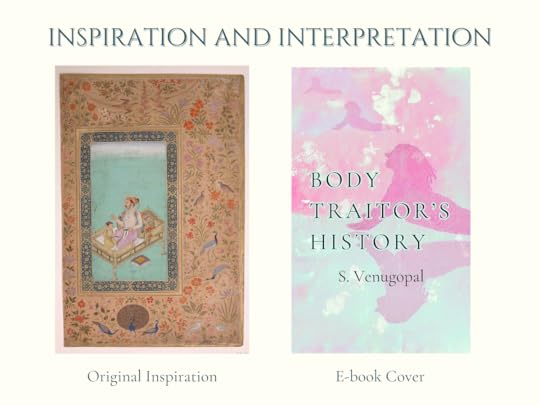
As an adult, however, I was entranced by a painting of a younger Emperor Shah Jahan with his son, Prince Dara Shukoh. The mint green background contrasting with the light purple fabric, the feverish use of gold lines, and the smaller human figures on the large cushion mesmerised me. (In case you are curious, the black stains under the emperor’s arms are because of the perfume he is using.)
 “The Emperor Shah Jahan with his Son Dara Shikoh”, Folio from the Shah Jahan | Album Painting by Nanha; Calligrapher Mir ‘Ali Haravi, via metmuseum.org
After months of experimentation and countless failed paintings, I finally landed on a workable base, achieved by randomly layering dark blue ink and copper and gold paint on a sheet of Chinese rice paper given to me by a penpal. Rice paper is extremely fragile and reacts almost violently to moisture, but is able to hold many more layers of pigment than your standard sheet of watercolour paper.
While the surface was still wet, I added gold flakes in no particular order or arrangement. As I scanned the original design to begin the digital edits, there was a light burn that you can see on the right hand column of the original piece.
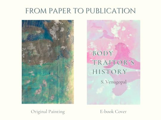
Using Adobe Lightroom on mobile (hey, it was free), I changed the colour tones until I achieved the mint green and pink/purple combination I was gunning for, while working to keep the gold flakes luminous.
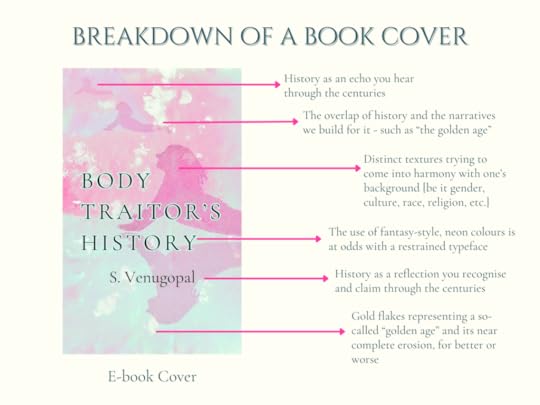
Regarding the human figure, I went for a recognisable yoga pose. Called the Cobra Pose in English, it shows a person (incorrectly) rising from a face-down position on the floor. I’ll leave the symbolism of it to you.
The figure in the image, which many believe to be the main character or the narrator, is actually me. I used a photo of myself, enlarged it on a screen, and traced it, thus again trying to avoid the pitfalls of freehand anatomical proportions. I transferred this tracing to a thick sheet of watercolour paper and made it into a paper doll of sorts, which I then scanned and slapped onto the original image in the style of a collage.
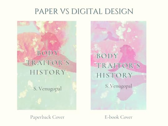
Due to how colours are processed, as well as differences in dimensions, the print and digital versions of the book have slightly different covers. I like the warmer green and pink combination on the paperback, but I feel that the digital version preserved the shimmer of the gold flakes and gave me more space to play with the paper cut-outs.
And finally, the meaning of it all.
The overarching theme of Body Traitor’s History is, to me, the truth of what we so carelessly call a “golden age.” Shah Jahan’s time is referred to as one, and while it might have been a golden age for Dara Shukoh during his childhood, one can hardly say the same for the people who died from septic wounds, malnutrition, slavery, parturition, or wartime atrocities.
Historians of a more religious or nationalist bent these days rudely demand that we agree with their evaluation of which ages were golden. Every hour, they stupidly eulogise worlds without Tylenol and Tiger Balm and labour laws and Wi-Fi that their own spoiled children would have not survived, but perhaps they have a point. After all, every age is gold for those who have the most of it.
The histories of those without gold, meanwhile, are defaced and replaced with more striking characters.
 An unused cover design concept for my novel that I may one day resurrect [screenshot taken from the Canva workspace]
Body Traitor’s History tries to address this question in good faith and, most importantly, with love. So if you’d like to give it a try here, I’d be very grateful.
paperbackE-book